Invest Nest

Project Overview
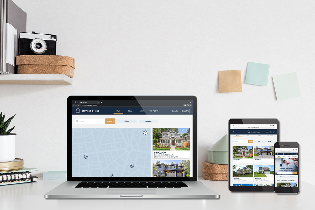
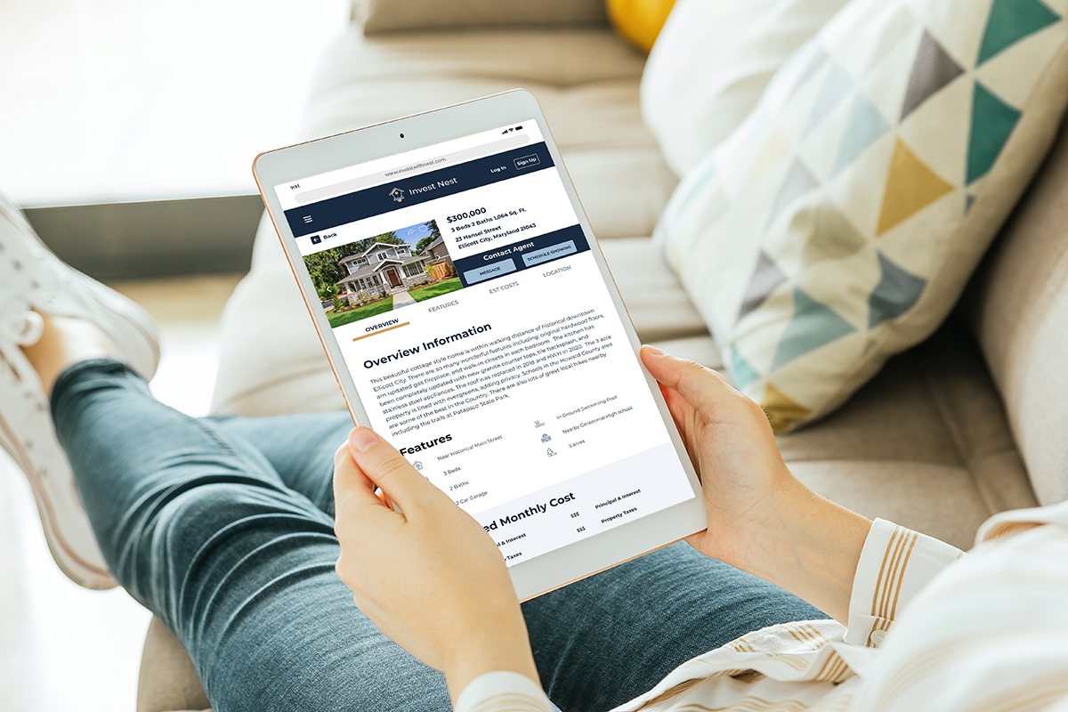
Invest Nest is a responsive web app focused on new, small-scale property buyers who are looking to invest for additional income or financial security. The app provides property buyers with comprehensive information on properties of interest, allows buyers to share or favorite properties, and connects investors with real estate agents.
Tasks & Deliverables
- User Flows
- Wireframes
- Prototypes
- Mood Board
- Logo Design
- Style Guide
Goals
- For buyers get a feel for a place by viewing comprehensive information about the property and its neighborhood before spending time on-site
- Ability for users to create a profile and save favorited properties
- Search and filter available properties
- Connect with real estate professionals to inquire about properties of interest
Design Process
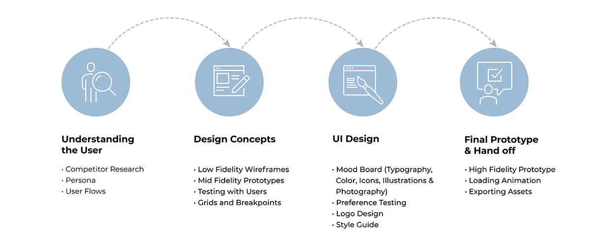
I began the design process by researching property information and user flows of some of the most popular home- buying websites like RedFin and Zillow. Throughout the design process, I created user flows, wireframe design concepts, an interface design and a final prototype in AdobeXD. I tested prototypes with real users and performed preference testing to iterate and improve on designs.
Understanding the User

Persona
Rashida is the prime persona for Invest Nest. She is a new to real estate investment and her main goals are to invest in properties to create financial stability for her family.
Defining the Problem
Problem Statement
Rashida needs an easy to use tool to search for properties of interest, find comprehensive information on each to save time before even viewing a property, and connect with knowledgable agents because she is new to real estate investment and would like comprehensive information on each property, a professional’s guidance, and the ability to view information on varying sizes of portable devices as she travels for work.
Hypothesis
Creating a responsive real estate web app with the capability to create an account, use search filters, save/share favorite properties and connect with a knowledgable agent will help Rashida find properties of interest quickly and provide guidance as a new investor.
User Flows
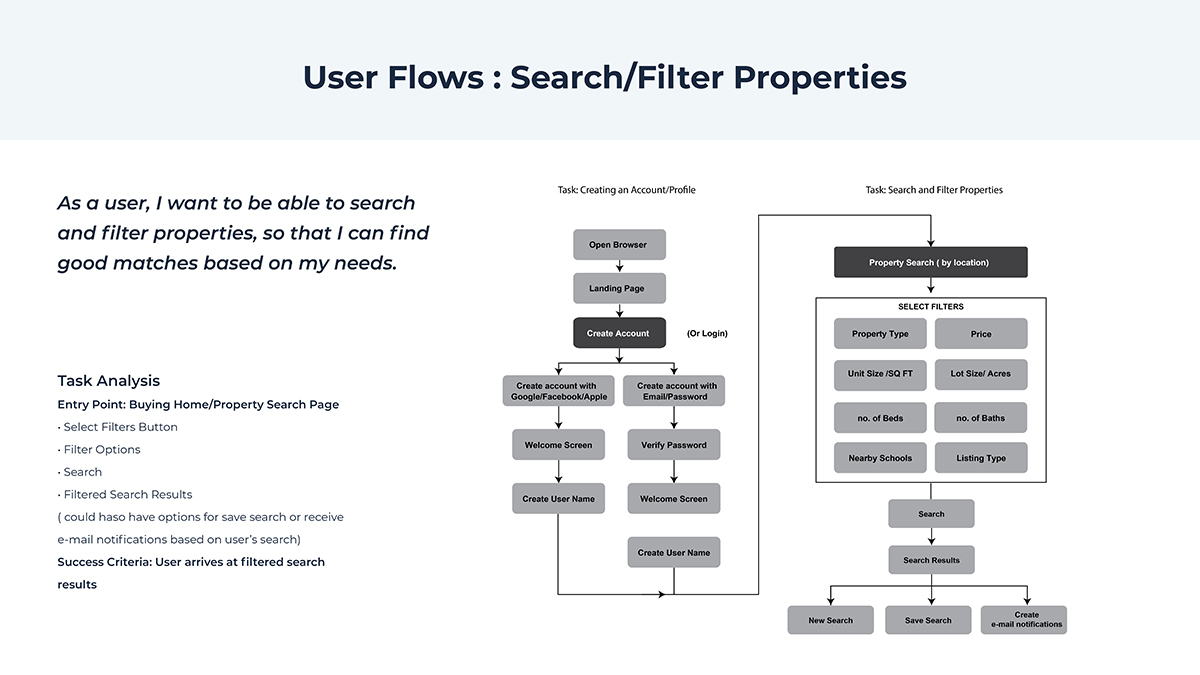
User Flows and task analysis were developed for creating an account, searching/filtering properties, saving a property, and contacting an agent.
Design Concepts
During the design concept phase, I created a responsive grid system, low fidelity wireframes, mid fidelity prototypes, and tested with real users.
Low-Fidelity Wireframes
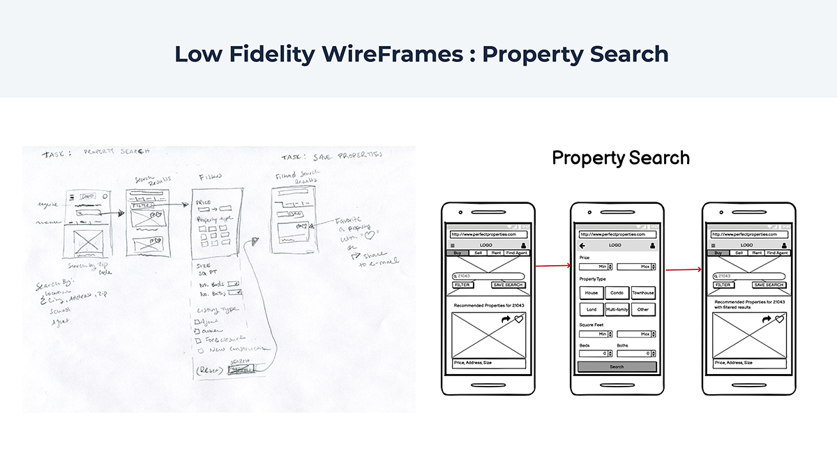
I started by sketching each screen in each user flow, then used Balsamiq to create low fidelity wireframes. I used the mobile-first method and began the design process with mobile wireframes.
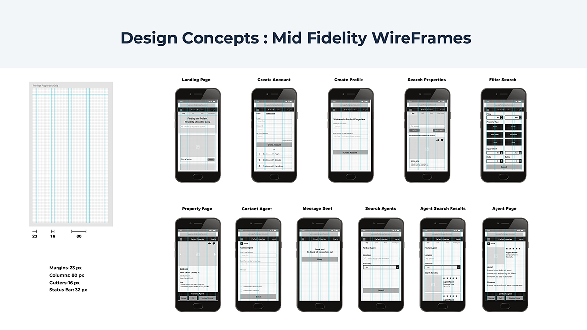
Mid-Fidelity Wireframes & Prototype
I created a responsive grid system which scales from 12 column on desktop, 8 column on tablet, and 4 column on mobile. I created mid-fidelity wireframes using the 4 column grid and began testing the prototype with real users. The main change participants wanted during testing was to move the filter and sort below the image on the main pages. They also thought the “save search” next to the search bar was confusing.
User Interface Design
During the design of the user interface design, I created mood boards, developed a brand, style guide, and high fidelity mockups.
Mood boards
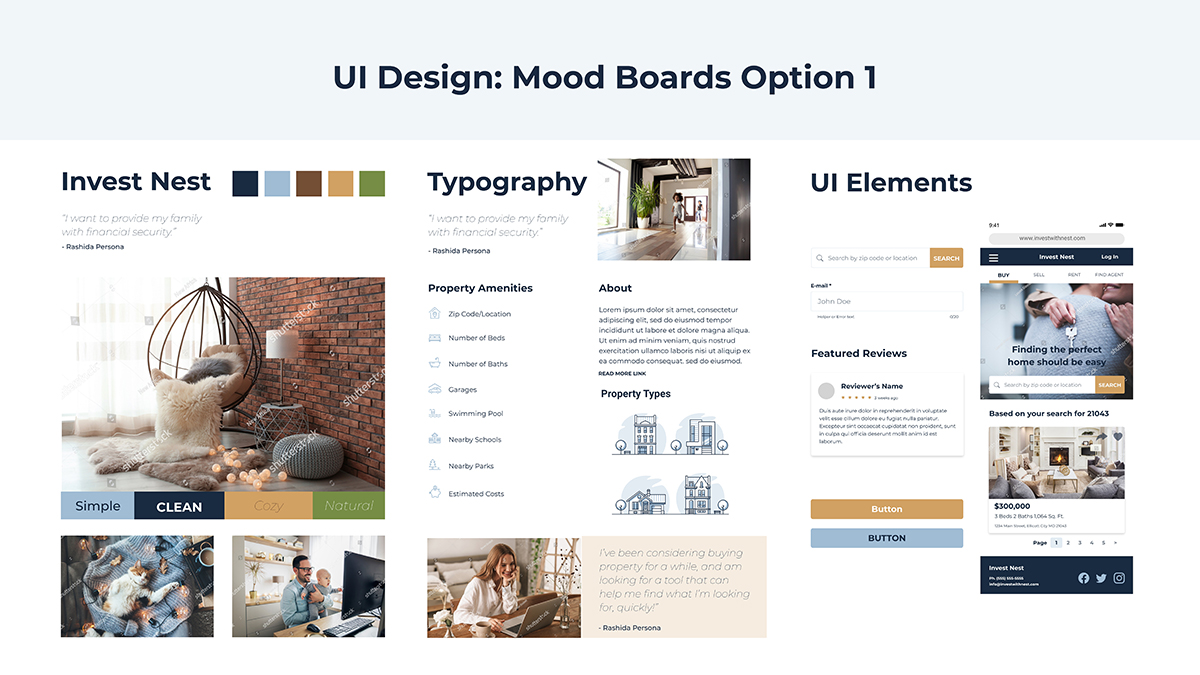
Two mood boards were created to show the look and feel of Invest Nest’s brand. For the design of option 1, I created a natural color palette to play off of a double meaning of “nest” as bird nest or “home”. I included a gold color in the pallet to represent coins/gold bars as well as “golden nest egg”. The images are warm and cozy and evoke a sense of a comfortable home life.
For the design of option 2, I based the color palette off of the red color commonly found on for Sale signs. The blue and red colors from America’s flag evoke the sentiment of “American Dream”. I included imagery typically found on real estate websites of real estate agents in suits and images representing property value increasing. I included options for overlaying color over images to make text stand out if it was used over top of imagery.
Preference Test
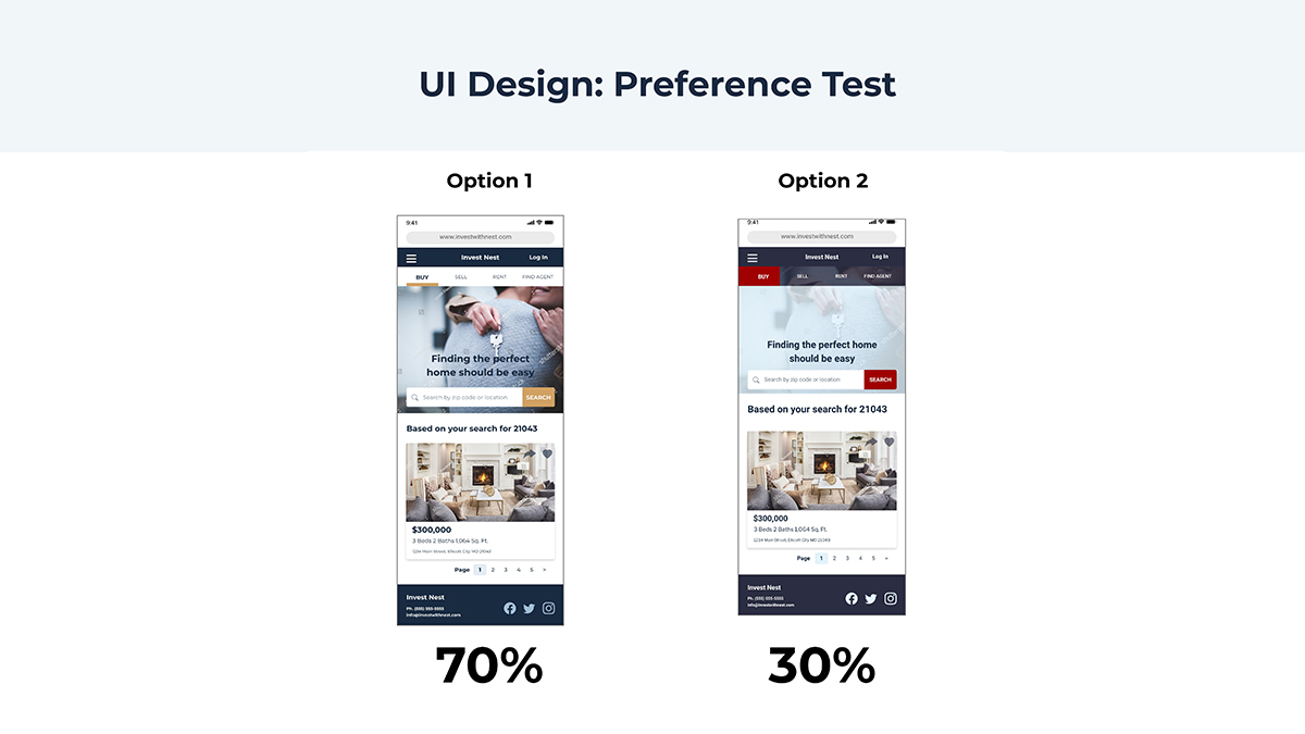
After conducting a preference test, I decided to move forward with option one. 70% of participants picked option one because they liked the color palette. A few participants also said they liked the underline style navigation bar because it was easier to read.
Logo & Style Guide
I chose a dark blue as the main color because it is associated with trust. I want users of Invest Nest to trust in the brand for their important decision of purchasing properties and investing in financial security for their families. The lighter blue color is reminiscent of a bird’s egg found in a nest in nature. The logo is a sturdy bird house. The short pointed post on the bottom could also act as a location arrow on a map. I chose gold to represent gold coins or “golden nest egg” as well as evoke the emotions of happiness and optimism. The gold also makes a great call to action color for buttons because it is complimentary to blue therefore high in contrast.
Secondary colors are lighter variations of the gold and blues to use as accent colors. I have also chosen a green and red that are in harmony with the color palette for login errors and user input.
I chose the Montserrat font family to be used in branding of Invest Nest. Its a font which is available as a google font so it can be viewable on every user’s screen without being installed locally. Its sophisticated in form and its thin weights work well with the line style of logo. All of the illustrations and icons were created in a line style to be cohesive with the overall brand design.
View Full Style Guide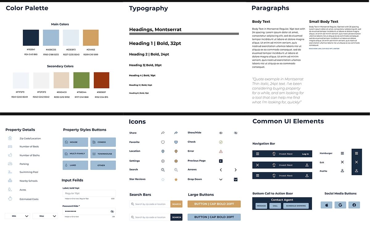
Final Prototype & Mockups
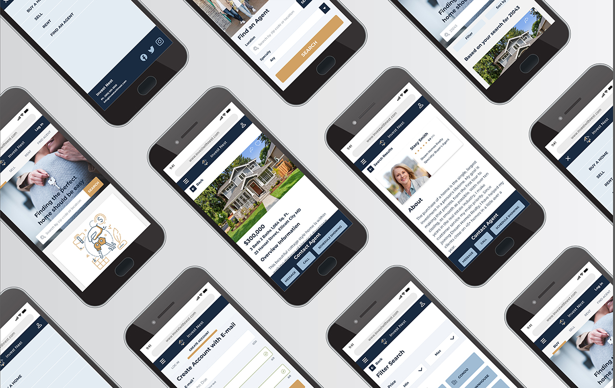
I created the final Invest Nest prototype in AdobeXD and exported all assets for the development team. Final mockups were created to show scalability from mobile to tablet and desktop screen sizes.
